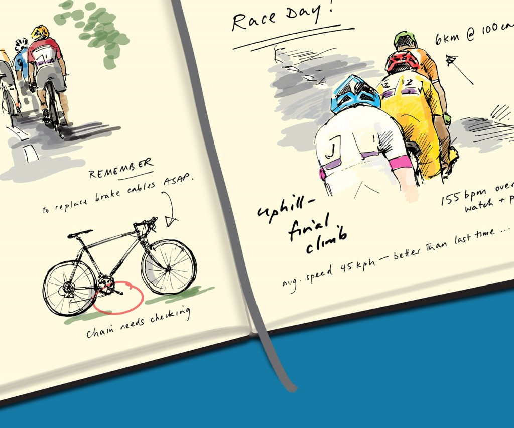
The exciting project that I mentioned last month is now live! I worked with Rosher Consulting to produce the splashscreen and store images, and app and tile icons for their great Windows Phone app called Ride Journal:
https://www.windowsphone.com/en-gb/store/app/ride-journal/1fba57ba-ebb8-4c3d-9100-fa8e699cd2cb
You can see more about the app at Rosher’s site here: http://ridejournal.rosher.co.uk/about
Given the purpose of the app to track your rides, monitor stats and store all the information in one place, Rosher wanted the main artwork to represent this concept as a physical, ‘hand drawn’ journal – very pleasing. As you might imagine for a phone app, Windows have pretty strict templates and guidelines for this kind of artwork, I think also that need to take into account the infinite ways in which people can configure their phones, so that was a nice challenge in itself. Also I don’t have a Windows phone so I was working from screenshots and mockups.
Rosher wanted me to keep the drawing nice and loose, so I scanned line drawings into Illustrator – as I guess I believe you can’t beat doing something by hand. But it does look like I was practising my handwriting at school though:
I then built a ‘journal’ background in Illustrator based on my trusty Moleskine, added some semi-transparent colour to look like my Faber Castell brush pens, moved stuff around – and voilà! Master artwork, and for the app splashscreen:

As it was in Illustrator I was able to move elements around to produce images with slightly different ratios, for example for the Store image and a panoramic image:


I also designed the app icon that would be used on the phone, and when opening routes or similar files in Ride Journal. A bit more of a challenge in one way to make it look distinctive on a small scale, so a few iterations later and Rosher suggesting that the icon should be the ‘closed’ journal – it ‘opens’, as the app does – and I came up with this:

I figured a mockup might be safer here than a Windows screenshot but hopefully you get the idea! The icon had to be transparent as of course it needed to take account of the different themes that can be selected, on a Windows Phone. All these things that I never would have thought of…
So that’s a brief rundown; it’s been a great experience. And there’s no excuse not to download it, if you have a Windows Phone, as it’s fantastic and Free! I hope Rosher are beginning to get plenty of installs…


