A long while back my mum wrote out her favourite Leonardo da Vinci quote on nature, on the back of a blank postcard, and asked me to make her a piece around it. Dutifully I filed it away in a work drawer, promptly forgetting about it for a number of years except when I had a spring clean and it resurfaced. I transferred it to a text file – in 2013! – and the same pattern continued.
As her special birthday approached recently I was completely stuck for a gift, when I remembered the postcard…
Calligraphy + illustration + framing = appropriate present!
All the things we had seen in Italy were floating around in my mind, and after thinking through various ideas – more along the lines of illuminated manuscripts initially, but I discounted these as too fussy – I remembered an appliqué work we had literally come across round a corner, in the Santa Maria Novella museum in Florence. Suffice to say we both thought it was glorious:

First steps for the piece were to work out the number of letters, a basic outline plan and size; this shows my workings before I had finalised the alphabet:

My calligraphy is just passable and I probably get away with it only because of the illustration, but fortunately I have a lot of resources and kit from my late Great Auntie Hilda who was a brilliant calligrapher and teacher. After looking through the books I have of hers, I went with an uncial alphabet from The Craft of the Pen, by John R Biggs:

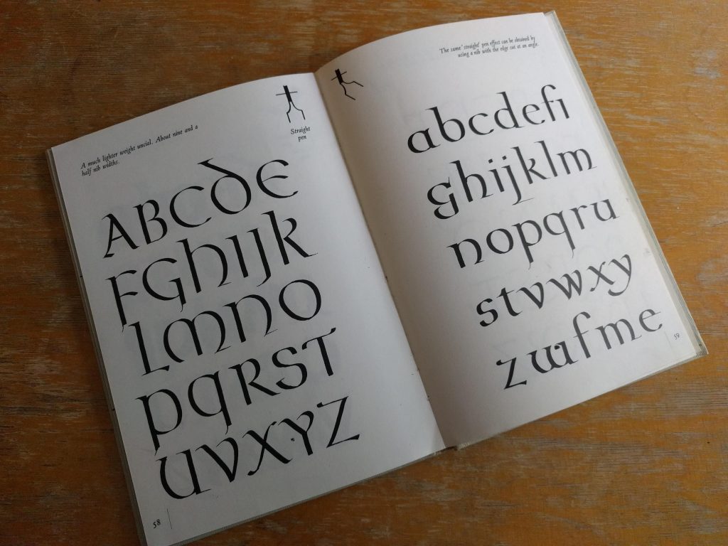
It’s a great book for the illustrations and visual instruction in forming letters, but there are also pleasures to be had in the surrounding text: I prepared myself to ‘…guard against vulgar and ostentatious eccentricities’ and ‘inebriate showmanship’, whilst always bearing in mind that a P ‘looks vulgar if the bowl is made too wide’. Lovely stuff.
I didn’t want to overthink the decoration too much, so I just got on with drawing up the text on heavyweight watercolour paper, and chose one of my auntie’s steel pens with a reservoir, using W&N sepia ink. John R Biggs would have been horrified by my posture, but I got the job done without mistakes – for some reason I had a sudden difficulty with spelling the word ‘subtlety’ – and then had a cup of tea to calm down.
Here’s a section of my trial sheet, I always find it nice to look at afterwards and in this case the colour is more representative than in the final photo.

The flowers and foliage were drawn out roughly before using watercolour, and were sourced in most cases from a reference book. I always tried to bear in mind the spirit of the Florence piece and the quotation itself, and to be honest what mum would actually like! I really enjoyed and relaxed into this stage and hopefully this is reflected in the fluidity of the illustration. Here is the final piece:

I was rather worried about getting it to the framers on time, hence the dreadful photo above, but as time goes on I have come to realise more and more that pressure seems to be a good workmate for me.
I’m happy to say it was very well received! Here it is framed and sitting in ‘present corner’ on the special day:
