New work

Drawing for the Mint

I recently worked on a wonderful project with The Royal Mint Museum as part of their Remembering Decimalisation activities. A great, creative way to engage a younger audience, the Museum ran a competition for year five and year six primary school children in Wales to write a short-story on this theme with the prize including – happily for me – accompanying illustrations!

First thoughts

The Children’s Laureate Wales Eloise Williams chose the winning story, ‘The life of a shilling’ by Rhys Davies, and the lovely team at the Museum soon sent over the text for me to get started.

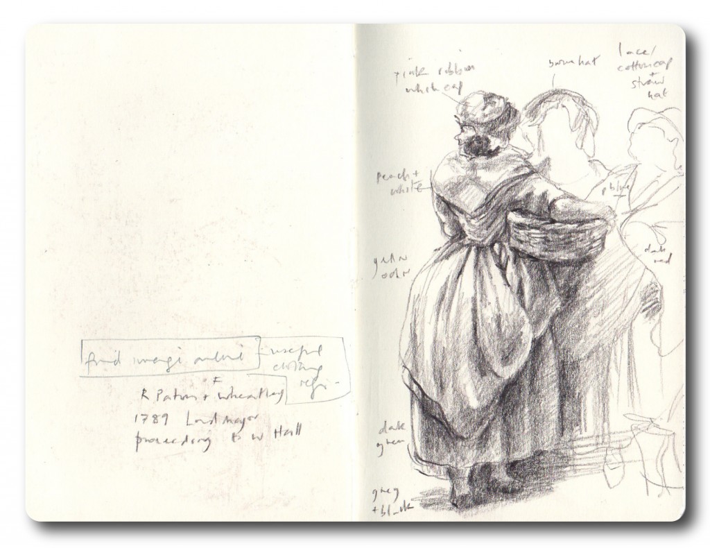
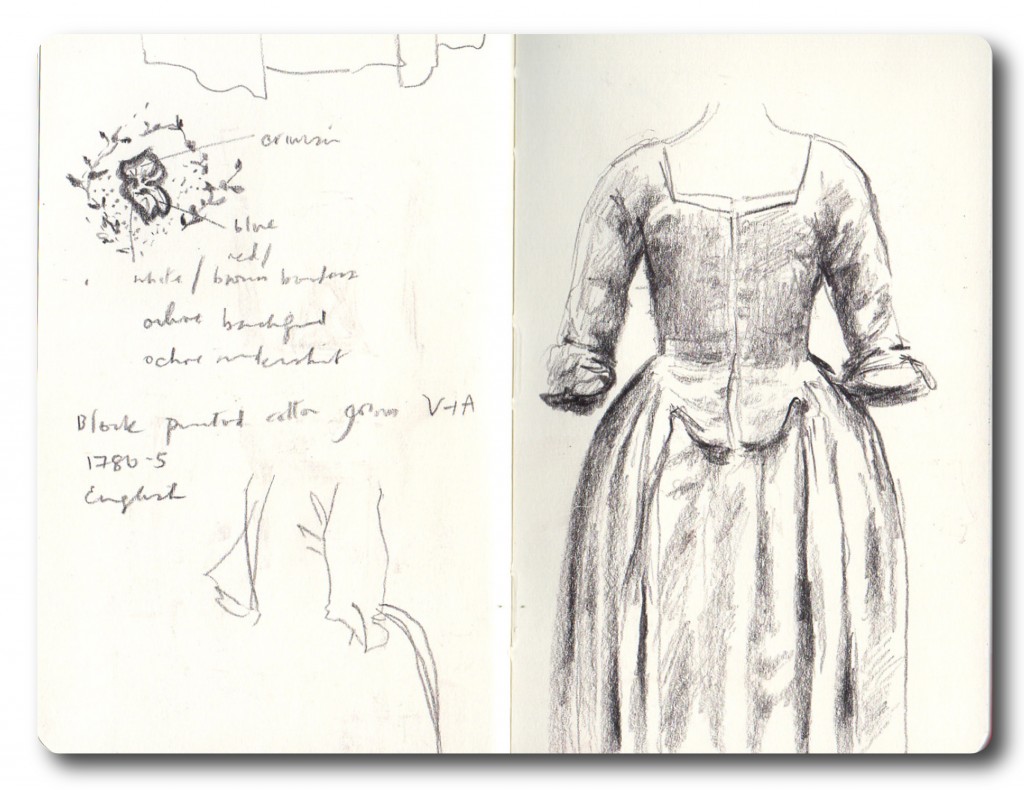
The story is a thoughtful and sweet-natured journey from the shilling’s creation at the Royal Mint in 1935, to usefulness, obscurity and back to desirability in the present day. Rhys’s vivid imagery and circular narrative immediately gave me a way into the illustrations, and I thought a less formal layout with vignettes dotted around the text would work best. A messy output below, but the first and important iteration!

The story would be published in various places, so I considered how the text and illustrations could work together on the page, and what kind of control over the format would be possible. Given the nature of the story and the competition I wanted to include references to Wales, a younger audience and decimalisation – and of course the ‘old shilling itself’ required a proper portrait. Here’s my second iteration, with the choice of imagery becoming clearer, and including a reference to my grandpa’s coin purse which suddenly came to mind!

Concept roughs

I got my concept together around a quick, indicative layout of the story text in Illustrator, but I hoped the Museum’s graphic designer would be able to add some much-needed polish! Thankfully this suggestion and the concept roughs below were well received by the team, and kindly put in train:

Final illustrations

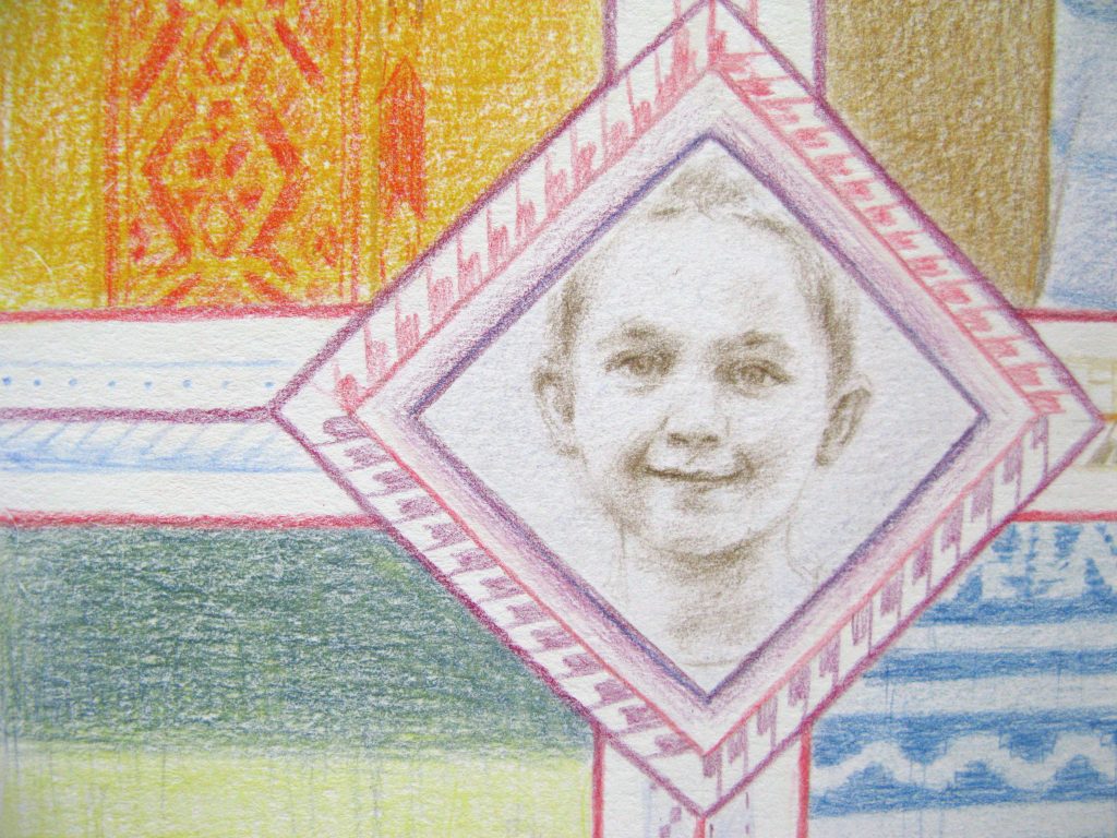
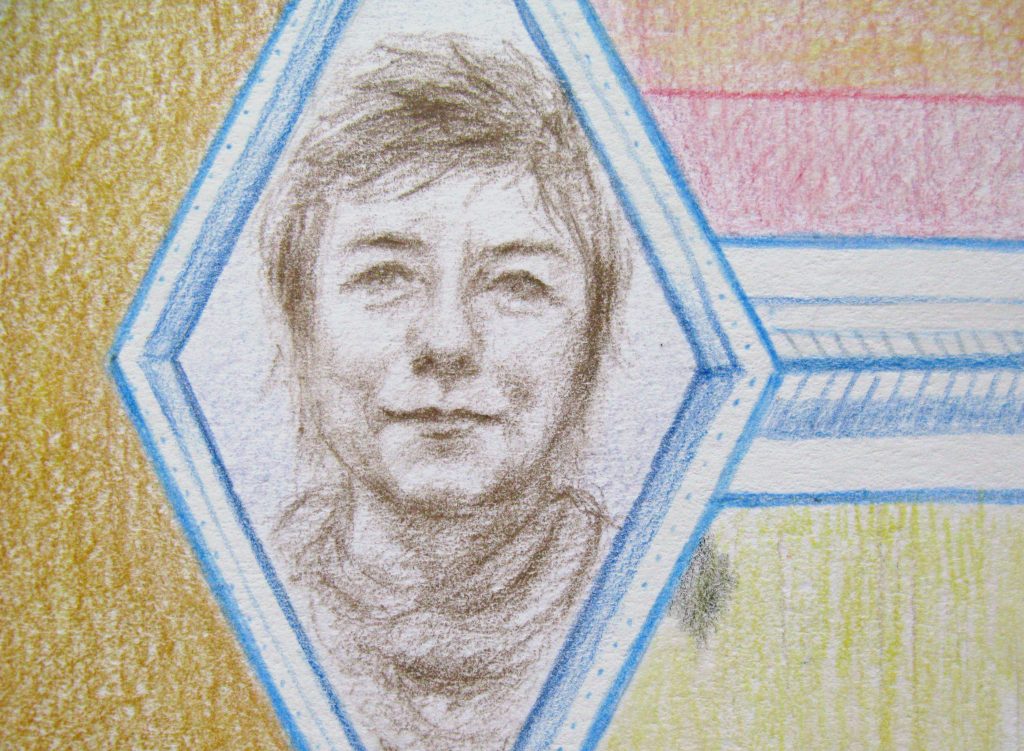
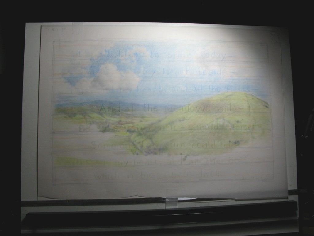
I decided on coloured pencils for the finished drawings, possibly with a watercolour wash. I thought this would be perfect for the nature and period of the story and to convey the sense of ‘little memories’ in the life of the coin. Last year I got a complete set of Faber-Castell Polychromos pencils, having been eyeing them for a while. They are by far the best I have used, with oily, buildable colour, amazing translucency in the lighter colours and proper depth and denseness in the darker. I gathered my references, materials, music source and refreshments, and hunkered down…

Mmmm pencils!

Bringing it all together

I started drawing on heavy Bockingford paper with a view to the watercolour wash but changed my mind early on, as the pencils were such a standout. It turned out to be a lucky discovery as the paper gave a good, stable surface with some texture that was very forgiving. The drawings were time-intensive but absorbing and rewarding, despite the usual late night minor panics! I got to know my old Epson scanner better, prepared the files and sent them over to the team and the graphic designer. I was so pleased with the end result and proud to be a small part of this joyful competition, including the very special virtual presentation to the winner at his school. Have a look at the individual illustrations in my portfolio but here is the finished product, and the wonderful layout courtesy of Nigel at Tuch:

A special piece

A long while back my mum wrote out her favourite Leonardo da Vinci quote on nature, on the back of a blank postcard, and asked me to make her a piece around it.  Dutifully I filed it away in a work drawer, promptly forgetting about it for a number of years except when I had a spring clean and it resurfaced.  I transferred it to a text file – in 2013! – and the same pattern continued.

As her special birthday approached recently I was completely stuck for a gift, when I remembered the postcard…

Calligraphy + illustration + framing = appropriate present!

All the things we had seen in Italy were floating around in my mind, and after thinking through various ideas – more along the lines of illuminated manuscripts initially, but I discounted these as too fussy – I remembered an appliqué work we had literally come across round a corner, in the Santa Maria Novella museum in Florence.  Suffice to say we both thought it was glorious:

Giovanna Garzoni (1600 – 1670), Santa Maria Novella museum – no copyright breach intended

First steps for the piece were to work out the number of letters, a basic outline plan and size; this shows my workings before I had finalised the alphabet:

My calligraphy is just passable and I probably get away with it only because of the illustration, but fortunately I have a lot of resources and kit from my late Great Auntie Hilda who was a brilliant calligrapher and teacher.  After looking through the books I have of hers, I went with an uncial alphabet from The Craft of the Pen, by John R Biggs:

Copyright Blandford Press, John R Biggs, 1961 – no breach intended

It’s a great book for the illustrations and visual instruction in forming letters, but there are also pleasures to be had in the surrounding text: I prepared myself to ‘…guard against vulgar and ostentatious eccentricities’ and ‘inebriate showmanship’, whilst always bearing in mind that a P ‘looks vulgar if the bowl is made too wide’.  Lovely stuff.

I didn’t want to overthink the decoration too much, so I just got on with drawing up the text on heavyweight watercolour paper, and chose one of my auntie’s steel pens with a reservoir, using W&N sepia ink.  John R Biggs would have been horrified by my posture, but I got the job done without mistakes – for some reason I had a sudden difficulty with spelling the word ‘subtlety’ – and then had a cup of tea to calm down.

Here’s a section of my trial sheet, I always find it nice to look at afterwards and in this case the colour is more representative than in the final photo.

The flowers and foliage were drawn out roughly before using watercolour, and were sourced in most cases from a reference book.  I always tried to bear in mind the spirit of the Florence piece and the quotation itself, and to be honest what mum would actually like!  I really enjoyed and relaxed into this stage and hopefully this is reflected in the fluidity of the illustration.  Here is the final piece:

Watercolour and ink

I was rather worried about getting it to the framers on time, hence the dreadful photo above, but as time goes on I have come to realise more and more that pressure seems to be a good workmate for me.

I’m happy to say it was very well received!  Here it is framed and sitting in ‘present corner’ on the special day:

Characters and gestures

I’ve been a bit preoccupied with IT exams in my other life recently, but eager to get back on the graphic novel-case. I’ve been reading Scott McCloud’s excellent book Making Comics, and as a really, really green comics reader I need some steerage at this point.

I’ve realised my figure drawing is very ropey after many years not doing it! Inspired by Scott talking about comics artists working in silhouette for full figures, I’ve been playing in Photoshop trying to capture gestures and character in some background scenes. I’ve been using pencils and graphic pens for years on this story, so a fresh approach being less precious has been a bit of a relief!  They are very much of one perspective but I don’t mind that at this stage – I’m seeing it as more of an exercise.

I enjoyed putting some background in to see how effective the characters could be in context.  As I was working I found my brain filling in the three-dimensional figure, a bit like the way I find producing drawings on black paper in reverse to be.

I also love silhouettes and they are an 18thC speciality so it will be interesting to see what ideas come of this!

Gentleman

Laundry women

Two men arguing

Character sketches

I’ve been working on more detailed character studies for my graphic novel, in between refining the narrative and the storyboards. I feel like it is increasingly taking shape, but simultaneously have had the realisation that there is more work to do now as my ambition grows for it; I want the people and the world around them to feel believable.

Nothing like a challenge eh?!

Family portrait

The reason I’ve been a little quiet of late online, amongst other things, is that I’ve been working on a lovely new commission.

I was asked to produce a family portrait for a ‘landmark birthday’ (hey, it’s not my place to divulge!) and as the conversation continued, we discussed their love of Laos textiles, a recent discovery for the family on their travels.

After some research the geometric design of many textile examples lent itself to the framing and linking of little portraits, showing the other family members.  Working through the roughs you can see it took me a few iterations to fix on the simplest idea, of one larger overall frame for the main portrait:

40th birthday - roughs01

40th birthday - roughs02

Print

Working from family photos, I started with the portraits in brown coloured pencil:

Progress before colour
Prior to applying colour

Rough colour overlay on final drawing
Digital colour


After some tests I abandoned my original intention of using inked patterns – in a different piece it would have been great, but the way things had transpired I felt it would overwhelm the delicate pencil portraits. I reckon I made the right choice. See what you think!

Family portrait - coloured pencil
Family portrait – coloured pencil

CloseUp01

CloseUp02

Detail2

It’s all I have to bring today

This is a recently completed private commission – a lovely piece to have been asked to do, and to have worked on.  The poem seems immediately quite simple and light, but of course speaks volumes.  As it followed on from ‘Silver’ I was in more of a calligraphy-based mindset, but I had to try and come up with something that had a timeless quality, and retained the lightness; and I thought a more modern, illustrative interpretation.  I decided the poem text should be overlaid, but this was after some wrangling over a purely text-based piece, or some kind of hybrid.  I had a fairly clear idea of what I wanted to get to, but as ever the challenge is articulating that…

Sketchbook concept rough

Sketchbook coloured pencil rough

The client wanted an ‘English’ landscape, something like a South Downs view – essentially the landscape is mythical but based in reality, and hopefully feels expansive.  As I progressed through the coloured pencil drawing I started adding text about halfway through as seen below, attempting to layout the poem lines in a tracing paper overlay to gain some sense of where words might ‘hit’ the landscape elements and details, which was probably the most challenging aspect as any kind of significant rubbing-out wasn’t really an option.  I needed to revisit the strength of the text a few times, firstly making sure that it didn’t get lost and secondly that the colours of the letters were essentially stronger and darker versions of those underneath.  There was a LOT of pencil sharpening going on.

Halfway, text in the planning

As the personal context for the poem was a spring event, I incorporated March flowers and plants into the foreground. I must cite a wonderful reference by Keith Jones, Seasonal Wild Flowers, for this information.   The Caslon Old Face alphabet was sourced from one of my great Aunt’s books, co-authored by none other than the inimitable Quentin Crisp:

© Frederick Warne & Co Ltd, 1976. No breach intended.

This is the finished piece, with details – excuse the slightly rough-around-the-edges photos!

Finished piece - coloured pencil
Finished piece – coloured pencil

Detail
Detail

Detail
Detail

IMG_4098