Here’s more rough and ready background material from my project…
Studio – Faber Castell brush penCharacter sketches – Faber Castell brush penTrade notice – Faber Castell brush pen
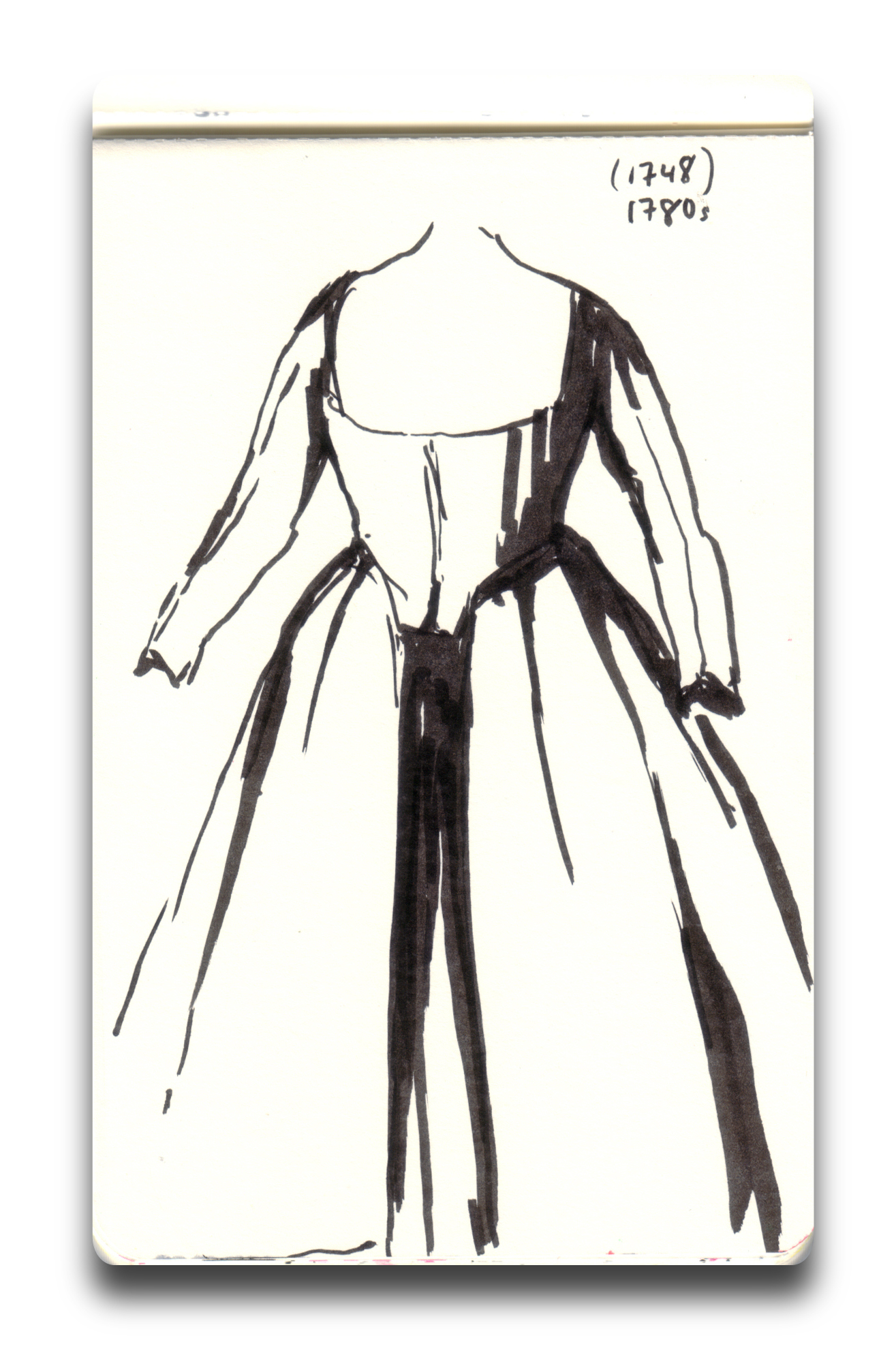
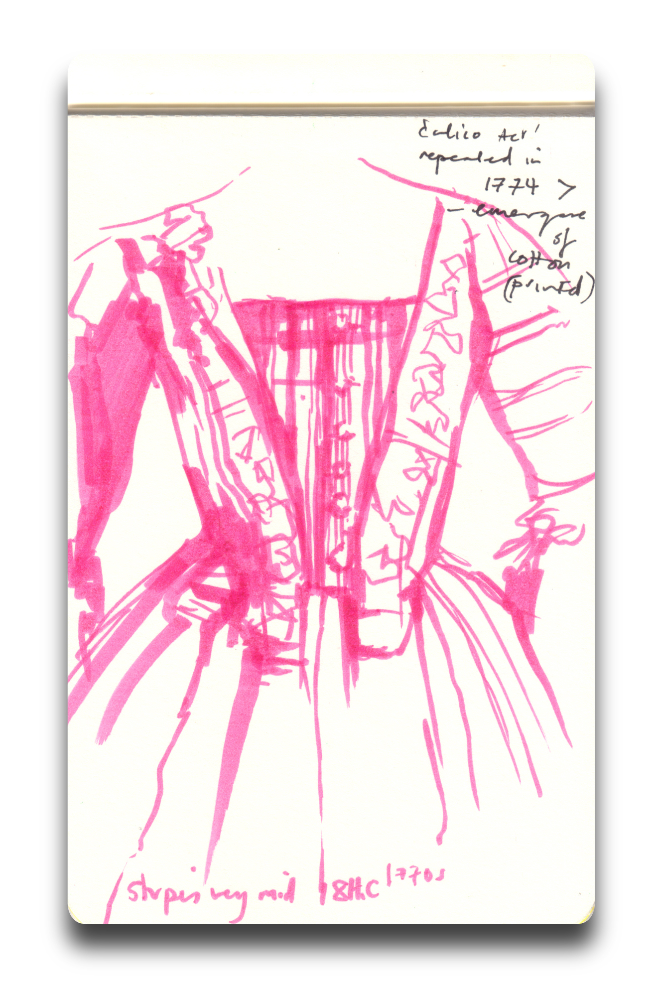
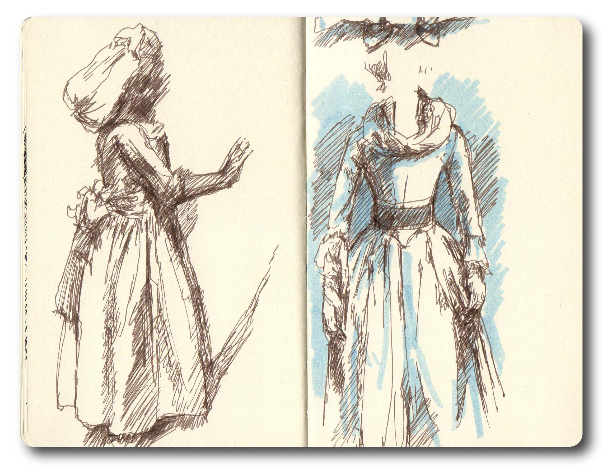
After meeting my brilliant friend Dr R for lunch today I followed her back to the Museum of London, and hung out in the Modern Life gallery for a while. Scared a number of people by sketching in the great but very dark Pleasure Garden installation amongst the mannequins, couldn’t see much but an interesting exercise and some great costumes – not to mention the atmosphere:
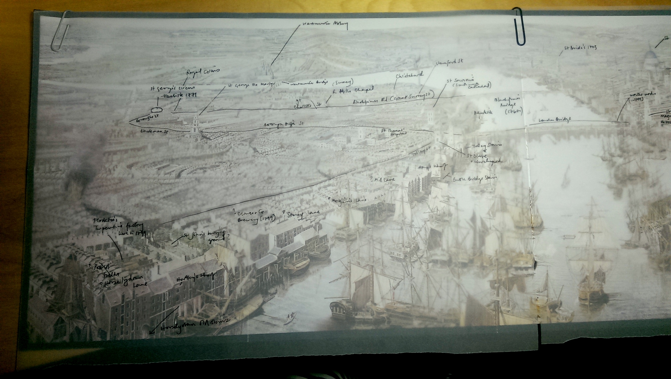
I’d been recommended the Rheinbeck Panorama of 1806 by one of the staff in the Southwark History Archive, can’t quite believe I’d not seen it before as it is absolutely fascinating. I bought the smallest possible version in the shop and seemed to have spent half the evening annotating the landmarks and geography, using the fantastic Grub Street Project 1799 Horwood map as a reference. Believe it or not it was so absorbing that I missed our online grocery shopping deadline, so I’ll be eating the tracing paper by next Tuesday:
Unbelievably it’s nearly June and the wedding of the year is over (see earlier posts…) and executed in spectacular fashion. The lovely newly-weds have sailed off into the sunset, specifically the Maldives, so I’m not jealous at all.
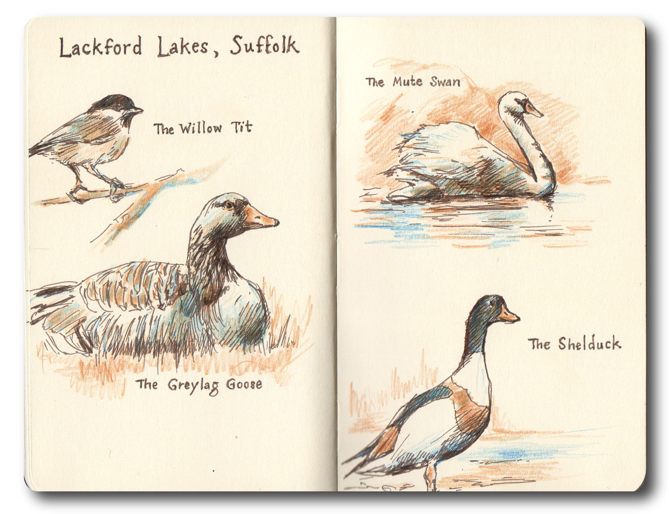
No really! Well, maybe a bit, but I’ve just had a week in Cornwall at the smaller but beautiful Fowey Festival of Words and Music. Lots of interesting events, as much Daphne du Maurier as fangirls like me can handle, and a wonderful and inspiring location. And the magnificent Richard and Judy! Given the full schedule I barely touched my sketchbook, but making up for re-purposed time now.
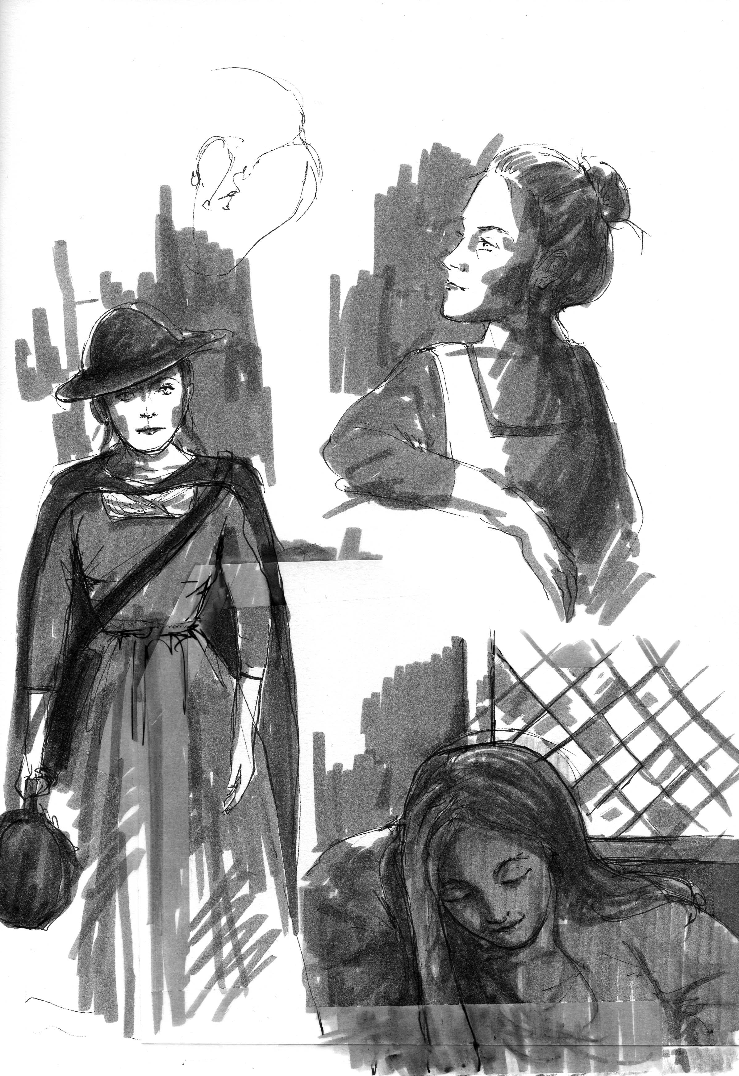
For a long while, in between projects, I’ve been working on a book in the shadows – picture book, graphic novel, maybe something entirely different, I’ve been reluctant to put a name on it – but it feels like the time now to start documenting it properly. Various pencil illustrations and mentions are on the site but don’t really have much context.
So in the hope that, like announcing you are ACTUALLY giving up smoking to people will mean that you REALLY do, here’s some of the sketch and background work for my project:
Storyboard page – Faber-Castell brush pen
I’m also hoping that having really given up smoking will mean that I get this done.
I’ve been trying to flesh out the narrative via storyboard, in addition to using my traditional and very descriptive notes. This is really helping to visualise sequencing, angles and point of view as well as the story so I guess I am feeling my way as I go.
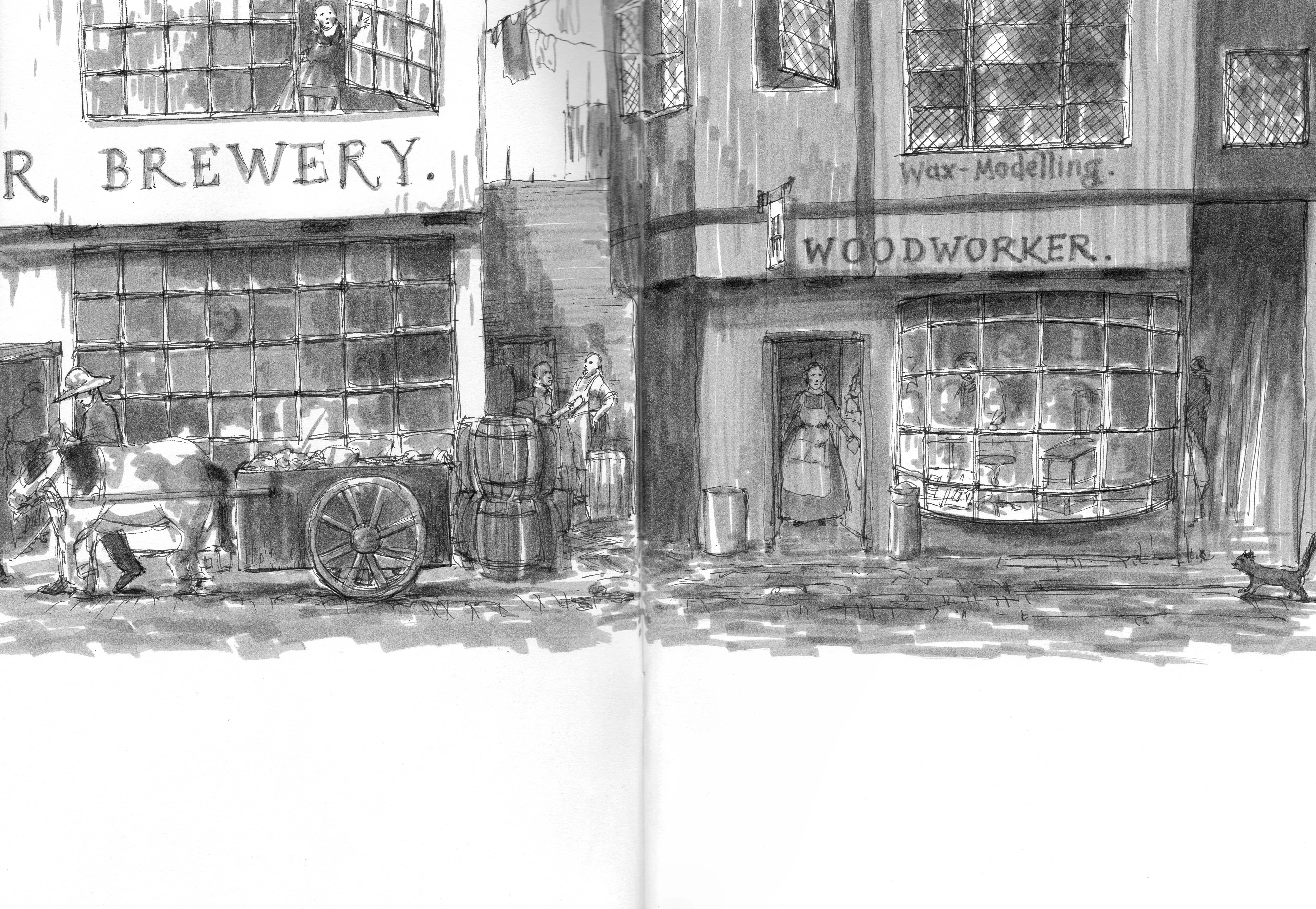
I have been looking at, researching and reading around the late 18thC and London for a while now, in various ways, and discovered the brilliant Guildhall Library and Southwark Local History Library and Archive. Not to mention using the BM’s Collection Online with a vengeance, somewhat ironic really. My story is very much set in London, closer to the river than us, in the ‘wild west’ of the time, in what is turning out to be a fascinating period of London and social history. I’m enjoying the fact that my bus commute and city travels have become something very different because of all this thinking and looking!
Sketch for Southwark street scene – Faber-Castell brush pen
And as you might expect from me there will be some darkness and gothica…
Sketch for the visit – Faber-Castell brush pen
I’m starting to flesh out the major scenes in more detail, in this way, which I think will help me to develop the characters and mood. I think it will also very quickly highlight where the gaps in my research are.
Phew.
And soon for something completely different – but I’ll have to wait to post that one…!
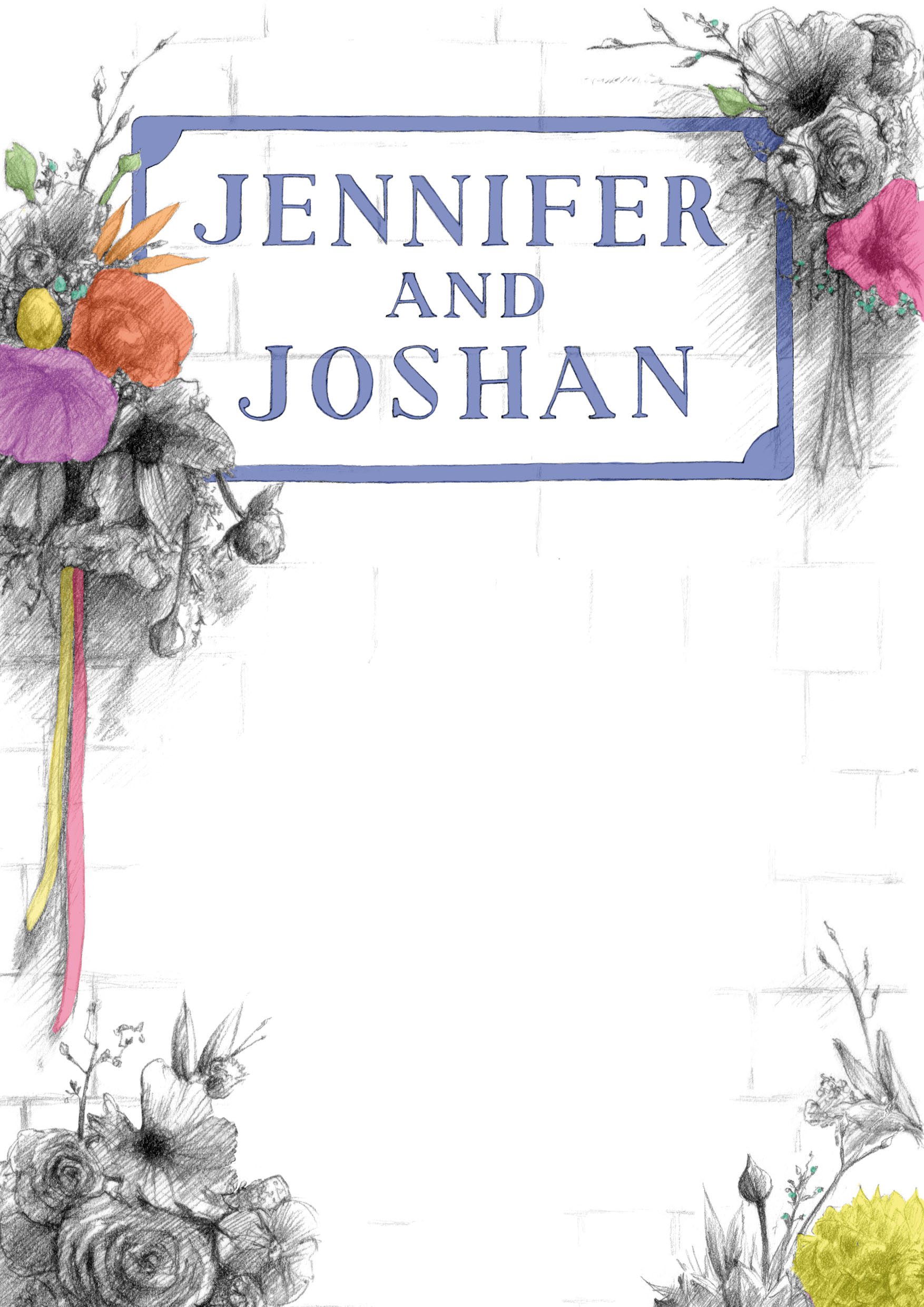
Well hello and happy Thursday – and here is the wedding invitation that I mentioned a little while ago!
It’s for a very special couple and was a real pleasure making it for them, not only because they are lovely people but also because they are creative, individual and interesting, and they inherently selected a venue that reflected that.
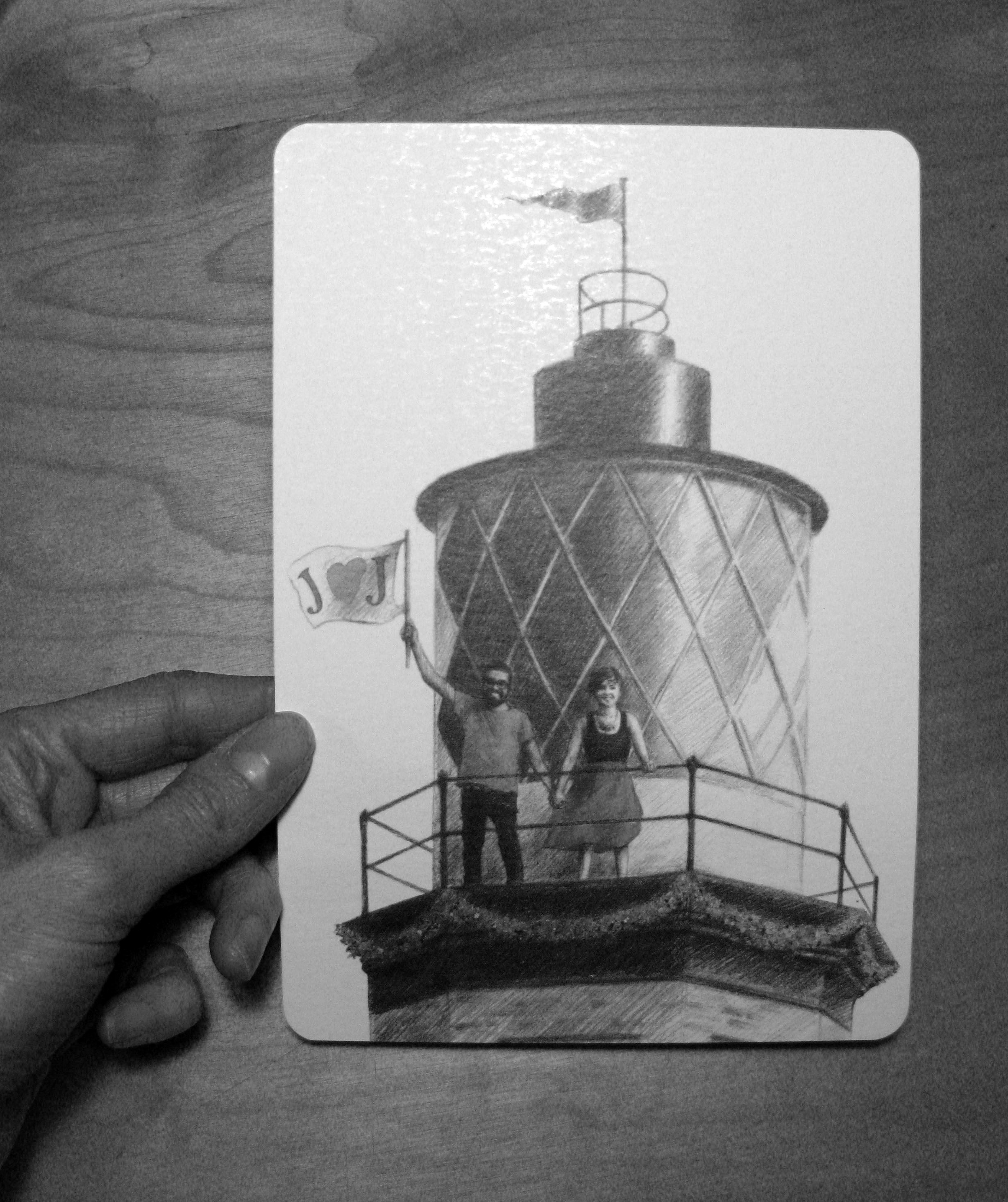
And one that was a gift! Full of great and graphic type, history and architecture. Initially I had a nose around Trinity Buoy Wharf to take some photos, and this is how the name text on the reverse came about, from the lovely painted typeface used on a wall to announce the wharf:
I thought about various effects, lens flares and that kind of nonsense to try and incorporate bright colours into the idea that they wanted, but came round to thinking that actually something less flashy and obvious would work better. I worked from my own photo of the wharf lighthouse, and asked them to take a semi-ridiculous one of themselves pretending to hold a flag. Hopefully that was worth it! The original pencil illustrations were scanned, tarted up and layered in Photoshop with areas of bright, isolated colour which were chosen to chime with the flowers and decoration to come on the day. To me, it also felt like a good reflection of how they are:
Main invite illustrationInvite reverse – for name and venue details
For obvious reasons I haven’t included the full text here but it was a fairly light serif font which fitted in with the detailed nature of the illustration.
Text sample
They also wanted a stamp to use in various ways and which would carry the theme through the reception – so I came up with a line version of the flag to use as wedding branding!
Stamp design, date redacted
I was pleased with the result – as always there is something I notice immediately that niggles – but more importantly I think the bride and groom-to-be were happy. Comments coming in so far seem to be very positive.
And J ♥ J – thanks for asking! Hope this travels with you into a wonderful lifetime together.
I appreciate it has been a long radio silence from me unfortunately, for many reasons – nursing a certain person through a hip operation, a very intensive period at work and a double chest infection. Meh. Anyway, new year, new start.
Here’s another name picture I did at the end of last year for some close friends, for their friends’ baby Jinjina. One parent is Dutch, the other Ghanaian, so I tried to incorporate both elements and words and places from both countries:
Pitt artist pen and watercolour
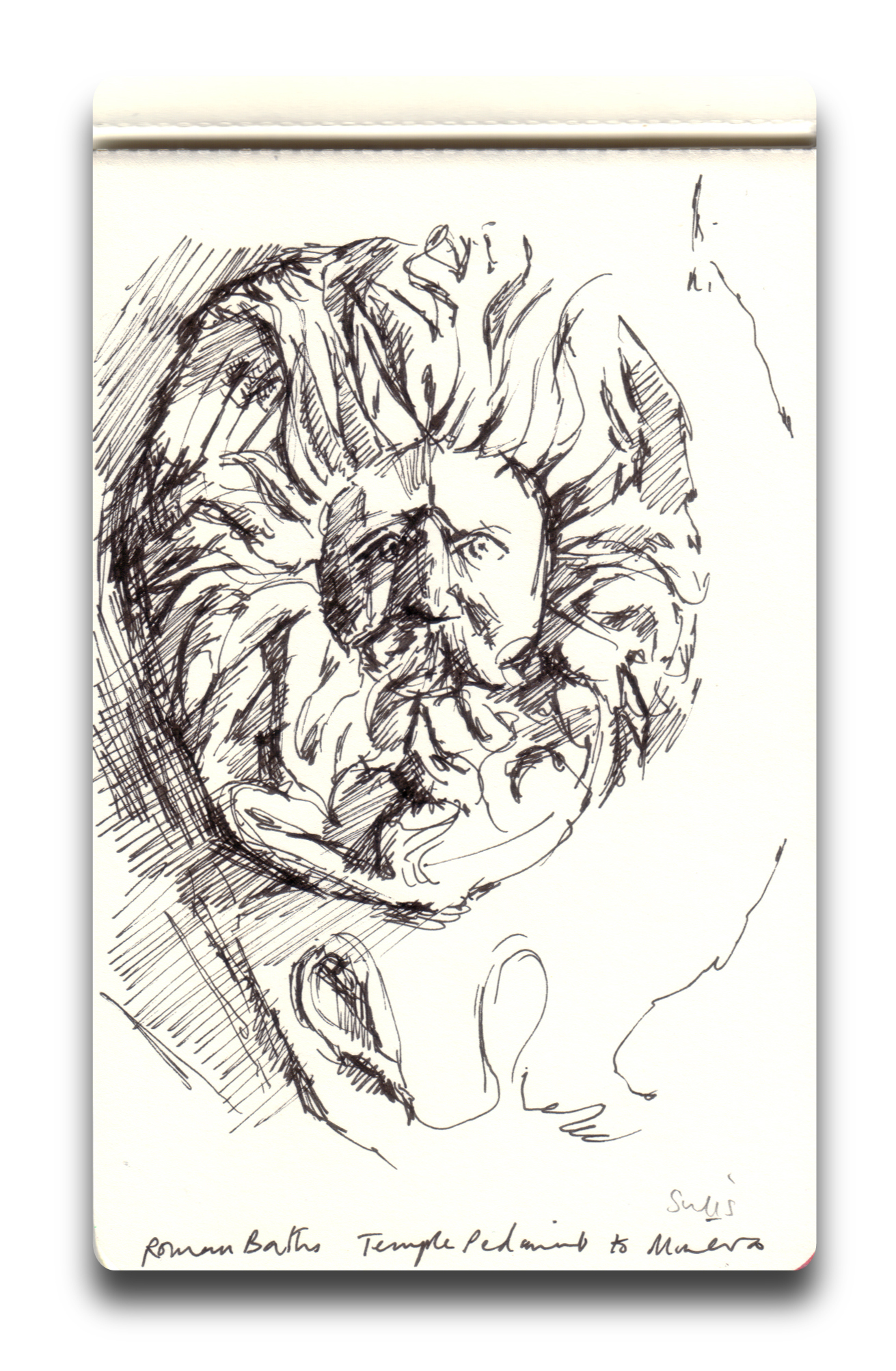
I’ll be back on the case again very soon with the last illustrations for the Curzon Project, lots of sketchbook work from a Bath field trip and a special wedding invitation for some very special people!


 I’d been recommended the Rheinbeck Panorama of 1806 by one of the staff in the Southwark History Archive, can’t quite believe I’d not seen it before as it is absolutely fascinating. I bought the smallest possible version in the shop and seemed to have spent half the evening annotating the landmarks and geography, using the fantastic Grub Street Project 1799 Horwood map as a reference. Believe it or not it was so absorbing that I missed our online grocery shopping deadline, so I’ll be eating the tracing paper by next Tuesday: