New work

The Death Cap

I recently received my limited edition copy of The Death Cap!  It is the second in the series of Professor Stubbs detective novels by R T Campbell, re-published by Lomax Press. The first story selected, Take Thee A Sharp Knife, was published in 2011, and I have been lucky enough to be asked to illustrate both dustjackets.  A very exciting project for me.

TDC front cover
TDC front cover


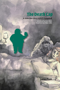
The design of TDC follows that set out with the first book, with a silhouette of the detective-in-question puffing away on his pipe at the crime scene – rather unhelpfully, but then everyone drinks and smokes constantly in the story anyway – and then appearing throughout the book at the end of each section:

Stubbs vector
Stubbs vector


I created a ‘death cap mushroom’ silhouette vector for the chapter endings too – last time this was a commando knife.  Nasty stuff!  I think the combination of these elements give a lovely continuity to the series.  The typesetting was again done by Omnis Partners, and gives an elegance and sharpness.

Mushroom vector
Mushroom vector

Excuse the ropey photograph but here is the jacket in full, next to the book itself in its nice black binding:

Dustjacket
Dustjacket

Been busy

Well it has been a little while since I last posted – but hopefully the new site will give you an idea of what I have been up to!  I finally ditched my ‘hand-crafted’ site, which I had been trying to maintain and update since about 2007.  It was good when Dave built the underlying structure back then…  Now everything is in one place and running on WordPress, which should make it a whole lot easier to manage and vastly improve its appearance.

I’ve also been working on the next Lomax Press book cover – but for obvious reasons I can’t show the illustration yet as the book is still in production – and a drawing for the waxwork project so I could enter it in the AOI awards.  Not really expecting much to happen to be honest, as I imagine they are inundated with entries and decent illustration but it is worth the effort.  Here is the Masqued Ball!

MasquedBall_RebeccaGreen
Masqued ball – coloured pencil

It’s on A3 Canford black paper again which seems to be my paper-of-the-moment.   I have come to terms with the fact that for these coloured pencil drawings the physical appearance is way too dark – they need a bit more punch and contrast that I can give them only in Photoshop.

The next thing on my list is to add to my Etsy site with some lower-priced items like greeting cards.  I like the thought of making cards again so it will be fun to design some (or use/bastardise some sketchbook drawings depending on what I can find…).  I used Moo for my business cards so will go back to them as the printing is excellent, but more unusually you can get multiple designs in a batch.  I think my business cards are supercute, not because of the subject matter but because they are small and rounded!  It was a bit of an experiment and I think the negative images work best, and at this scale they remind me of little carte des visites:

Moo cards
Moo cards

Kidnapped!

I recently made this leaving card for my manager at the BM – he had been there 34 years so had a special send off.  I made a pamphlet binding (thanks for the tips and materials Mum) and hand lettered the front cover, directly on to the cloth.  With an indestructible and rather heady-smelling gold pen.  The ‘Alan Breck’ illustration was in pencil originally, scanned and digitally coloured, and then printed by trusty Photobox in a matt finish.  I wanted it to look like a reproduction, something slightly boy’s own and old fashioned, and I’m pretty happy with it.  Glad I took the time to recess the illustration by adding a piece of card with the oval cut out, to the front board.  I wish I had glued the cloth better as I had a few bubbles, but I don’t think it’s too bad for some late night guerilla bookbinding:

Kidnapped
Kidnapped bound card
Kidnapped
Illustration close up
Kidnapped
Bound with cloth and marble paper end papers

Patterns of the mind illustration

I’m working on some illustrations for portfolio mockups – more specifically targeted at the editorial sector.  This is today’s effort, I’m quite pleased with it as I think it has retained the inked patterns that I started with, and with a bit of tweaking as ended up approaching what I envisaged:

Ink, pencil and digital colouring


Mockup – article copyright Psychologies Magazine, Kelsey Publishing Ltd – Oct 2012 issue


In the studio

Sorry rubbish title for a post but it’s 11pm and I’ve run out of ideas!

Here’s another drawing in the same vein as last week’s…as Dave said, the printers would love me for my paper choice, but I’m persisting.  The colour is still a bit lurid though and I’m having to make it a bit more punchy to show up on the screen.

Not so sure about this one as the last but I think it has atmosphere.  I want there to be something filmic to the drawings too and I reckon a sequence will improve it.

I’m going to the NPG store in Southwark next week to draw from some death masks, all being well, so I am a mixture of slight nervousness and excitement at the prospect!  Weirdy Wednesday coming up…

Coloured pencil