


I recently entered these two illustrations in the Brontë Society Creative Competition – had I got myself into gear earlier I may have entered more, but this was the minimum (2-4 illustrations), and you know that I like a deadline!!
I chose Jane Eyre to illustrate as it really is my favourite Brontë novel of those I have read, I think it is wildly romantic in a kind of buttoned-down, early Victorian way, Jane’s true passionate self bursting through after years of suppression at Lowood. It has it all, including the superb Mr Rochester. And she draws!
I’ll carry on with this as I have a few more illustrations started (but not come to fruition, well not sufficiently to submit) but here goes – my idea was not to include Jane in the images and to show them from her perspective, as she narrates the story of course – so she would only be seen in a mirror:
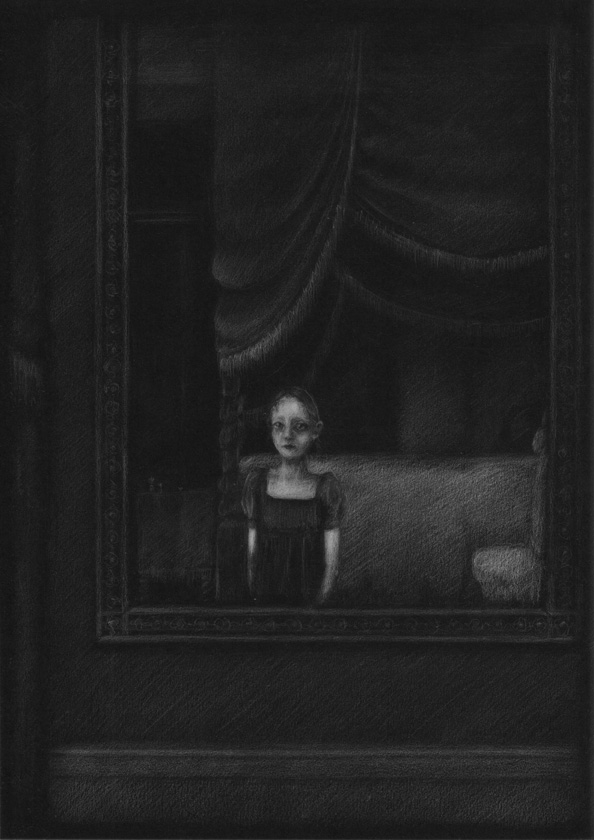
![Chapter XIX: [About the 'Sibyl'] “She shut her book and slowly looked up; her hat-brim partially shaded her face, yet I could see, as she raised it, that it was a strange one. It looked all brown and black: elf-locks bristled out from beneath a white band which passed under her chin, and came half over her cheeks, or rather jaws: her eye confronted me at once, with a bold and direct gaze...'](http://www.rebecca-green.com/blog/wp-content/uploads/2014/02/JaneEyre_Gipsy_72.jpg)
I recently received my limited edition copy of The Death Cap! It is the second in the series of Professor Stubbs detective novels by R T Campbell, re-published by Lomax Press. The first story selected, Take Thee A Sharp Knife, was published in 2011, and I have been lucky enough to be asked to illustrate both dustjackets. A very exciting project for me.
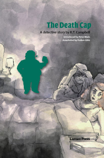
The design of TDC follows that set out with the first book, with a silhouette of the detective-in-question puffing away on his pipe at the crime scene – rather unhelpfully, but then everyone drinks and smokes constantly in the story anyway – and then appearing throughout the book at the end of each section:

I created a ‘death cap mushroom’ silhouette vector for the chapter endings too – last time this was a commando knife. Nasty stuff! I think the combination of these elements give a lovely continuity to the series. The typesetting was again done by Omnis Partners, and gives an elegance and sharpness.

Excuse the ropey photograph but here is the jacket in full, next to the book itself in its nice black binding:
