News ‘n chat

It’s all I have to bring today

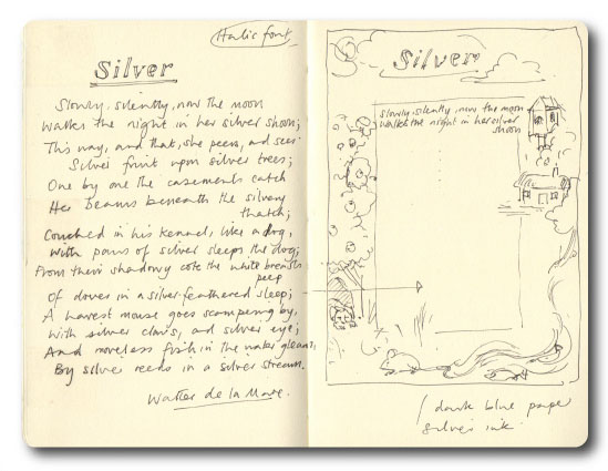
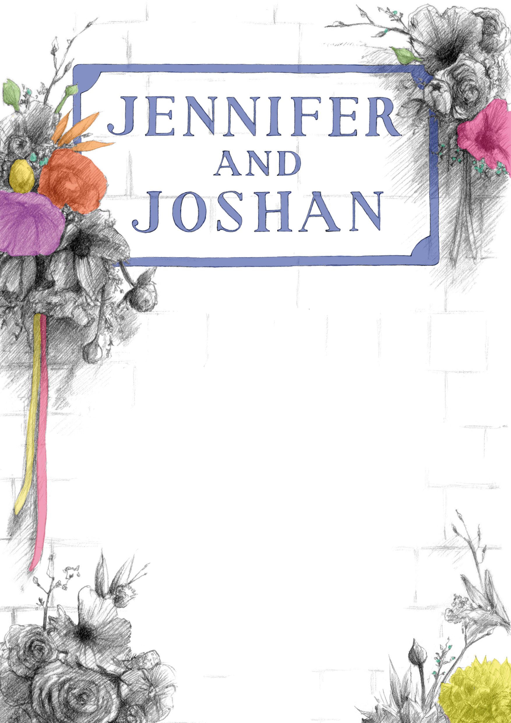
This is a recently completed private commission – a lovely piece to have been asked to do, and to have worked on.  The poem seems immediately quite simple and light, but of course speaks volumes.  As it followed on from ‘Silver’ I was in more of a calligraphy-based mindset, but I had to try and come up with something that had a timeless quality, and retained the lightness; and I thought a more modern, illustrative interpretation.  I decided the poem text should be overlaid, but this was after some wrangling over a purely text-based piece, or some kind of hybrid.  I had a fairly clear idea of what I wanted to get to, but as ever the challenge is articulating that…

Sketchbook concept rough
Sketchbook coloured pencil rough

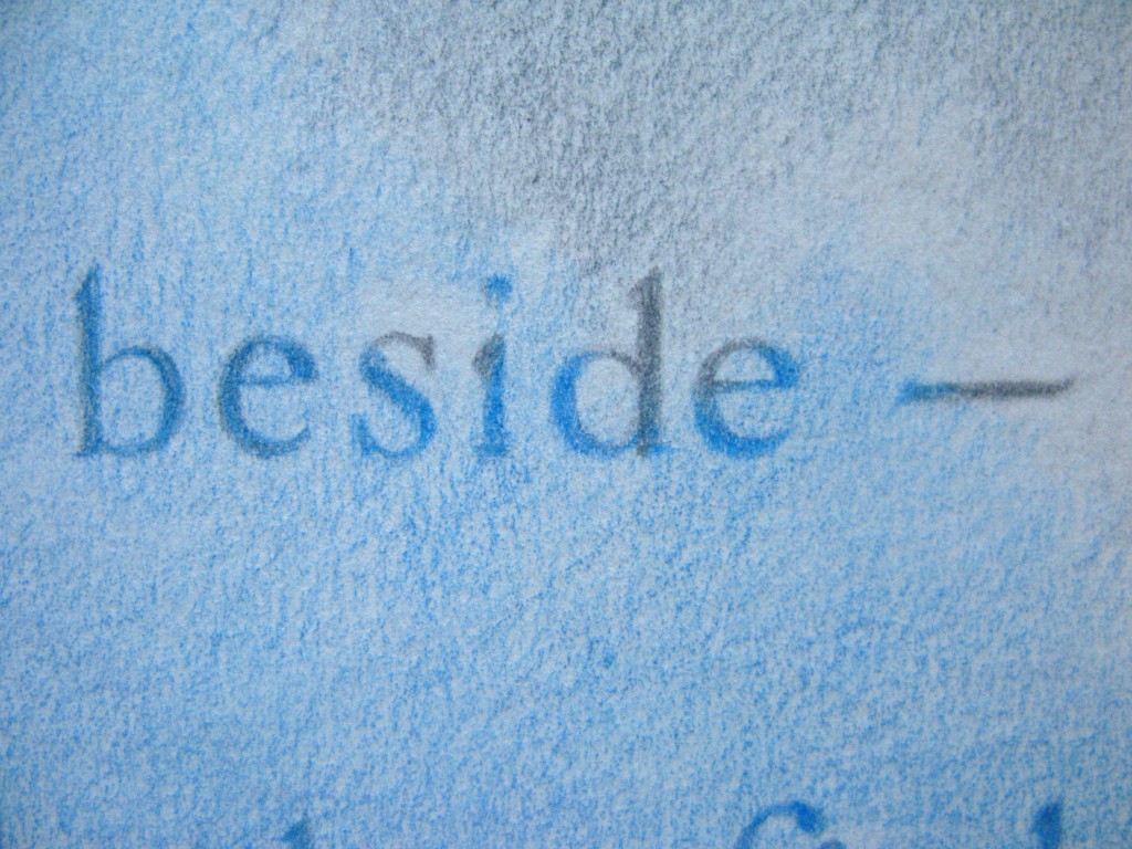
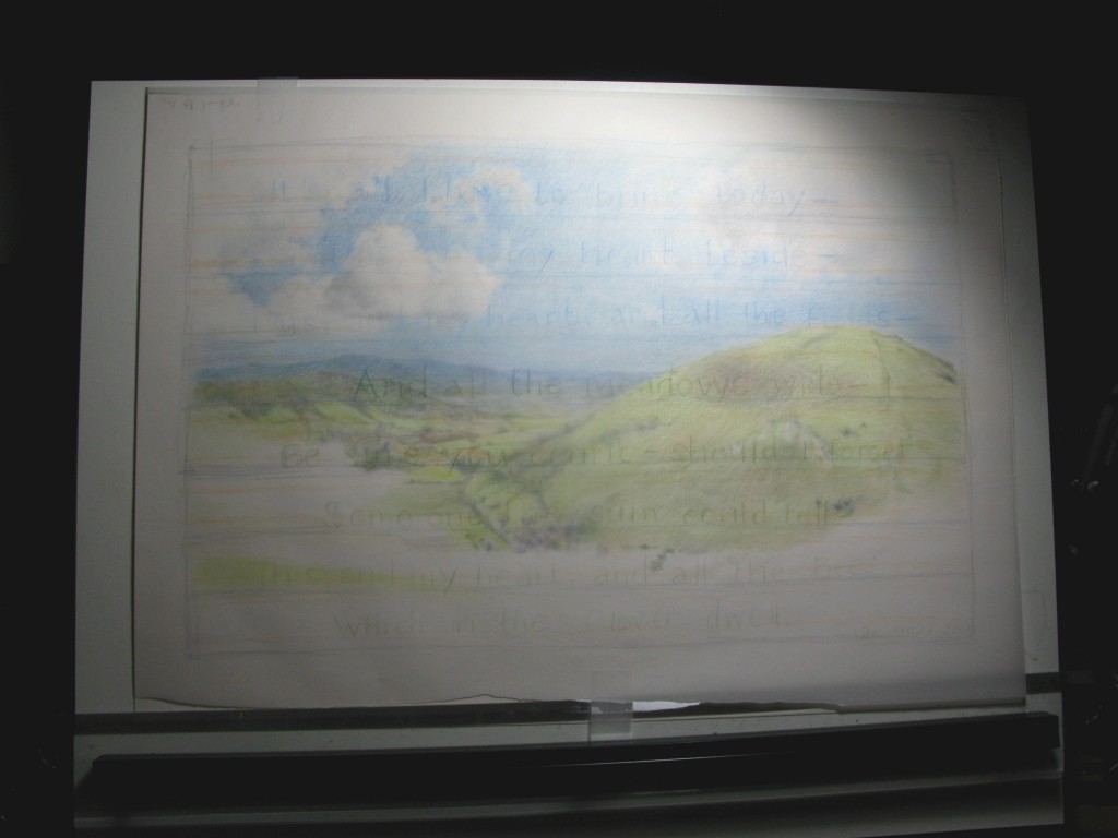
The client wanted an ‘English’ landscape, something like a South Downs view – essentially the landscape is mythical but based in reality, and hopefully feels expansive.  As I progressed through the coloured pencil drawing I started adding text about halfway through as seen below, attempting to layout the poem lines in a tracing paper overlay to gain some sense of where words might ‘hit’ the landscape elements and details, which was probably the most challenging aspect as any kind of significant rubbing-out wasn’t really an option.  I needed to revisit the strength of the text a few times, firstly making sure that it didn’t get lost and secondly that the colours of the letters were essentially stronger and darker versions of those underneath.  There was a LOT of pencil sharpening going on.

Halfway, text in the planning

As the personal context for the poem was a spring event, I incorporated March flowers and plants into the foreground. I must cite a wonderful reference by Keith Jones, Seasonal Wild Flowers, for this information.   The Caslon Old Face alphabet was sourced from one of my great Aunt’s books, co-authored by none other than the inimitable Quentin Crisp:

© Frederick Warne & Co Ltd, 1976. No breach intended.

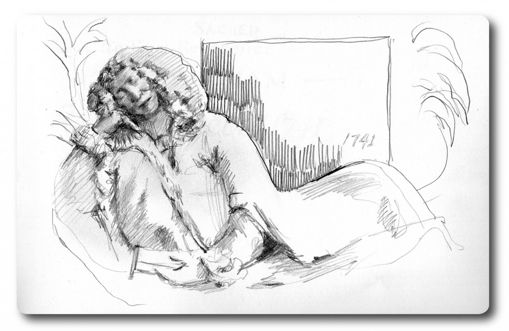
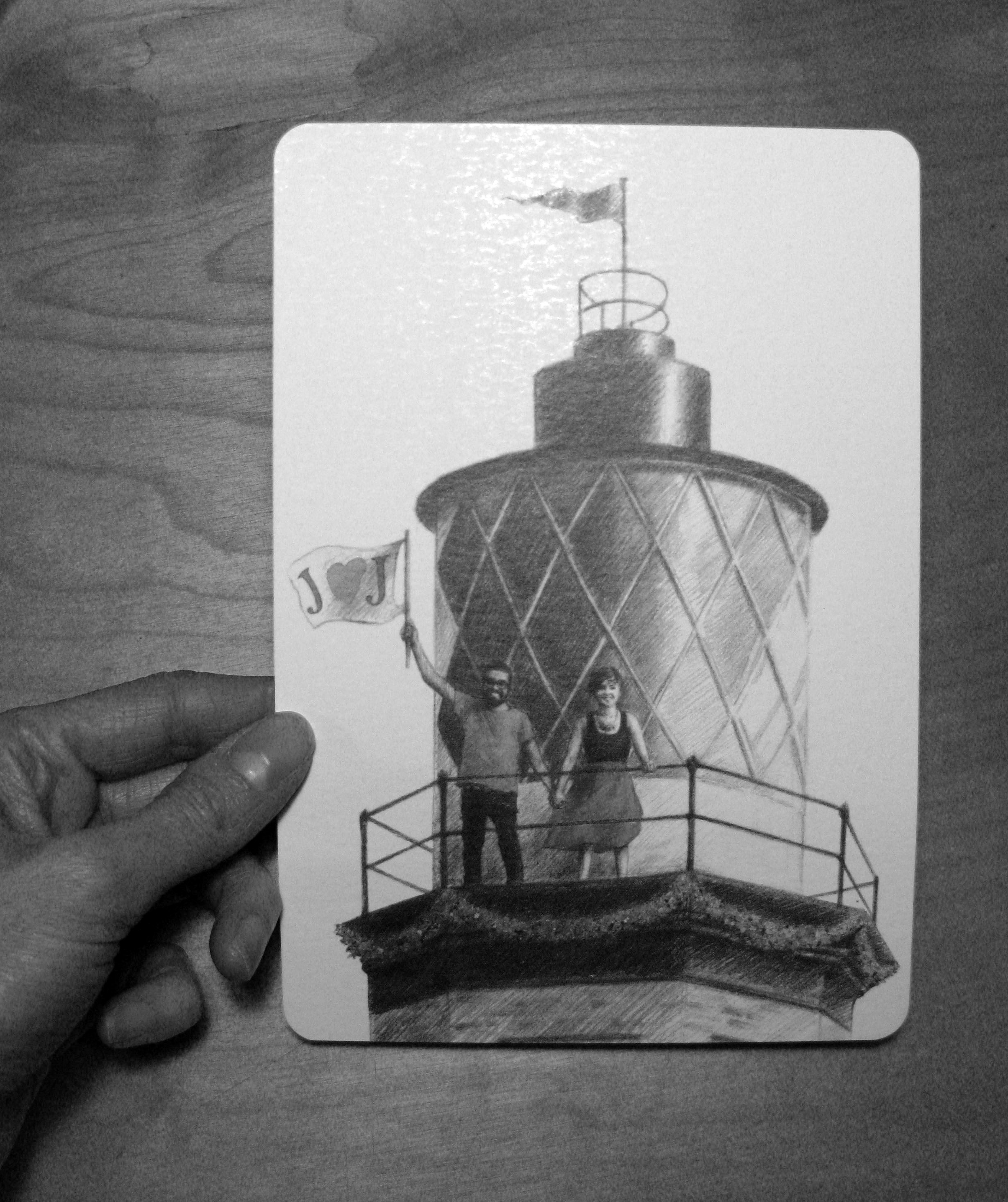
This is the finished piece, with details – excuse the slightly rough-around-the-edges photos!

Finished piece - coloured pencil
Finished piece – coloured pencil
Detail
Detail
Detail
Detail

IMG_4098

Silver

Recently I was lucky to be given a commission to illustrate a Walter de la Mare poem, ‘Silver’.  After some thought I wanted to produce a piece along fairly traditional lines, calligraphy surrounded by an illustrated border.  The poem naturally suggests something very decorative and using silver ink to enhance this seemed like an obvious choice!

It look me a little while to get back into calligraphy (as seen in an earlier post!) but it was a great challenge, reacquainting myself with line spacing, pen strokes and fonts.  And it has made me want to do more, especially as I have such wonderful materials and texts from my great aunt’s collection.  Also I barely scraped the surface as it such a complex discipline, and like many things, if it is all working correctly should look much more effortless than I can probably make it appear!

Here’s my initial roughs, which aren’t so far off the finished piece:

Notebook rough
Notebook rough
Rough idea using silver pencil

Having found some lovely W&N silver calligraphy ink in the LGC I got to work with practising a traditional italic font, and planning out the line spacing and margins.

Here’s my plan!  As you can see I really tried to ensure the flourished letters had some rhythm and didn’t interfere with other characters on surrounding lines.  I went with a standard margin layout, but which allowed plenty of room for the surrounding illustration:

Layout planning
Layout planning

Following this and some more tests with the pen and brush, I just got stuck in!  This is the finished piece – I tried using a pen for the illustration but it felt too tight – I always love using a brush with ink, and watered down the ink at times.  I started by giving it some depth with black ink, using the blue paper as a mid-tone and finishing with the silver.   As often with these things the brushwork was fairly quick (as my other half exclaimed when he turned round to find it finished!) but I think it maintains some fluidity and a lighter touch.

Any comments most welcome!

Finished piece - pen and ink
Finished piece – pen and ink


Ride Journal released!

The exciting project that I mentioned last month is now live!  I worked with Rosher Consulting to produce the splashscreen and store images, and app and tile icons for their great Windows Phone app called Ride Journal:

https://www.windowsphone.com/en-gb/store/app/ride-journal/1fba57ba-ebb8-4c3d-9100-fa8e699cd2cb

You can see more about the app at Rosher’s site here: http://ridejournal.rosher.co.uk/about

Given the purpose of the app to track your rides, monitor stats and store all the information in one place, Rosher wanted the main artwork to represent this concept as a physical, ‘hand drawn’ journal – very pleasing.  As you might imagine for a phone app, Windows have pretty strict templates and guidelines for this kind of artwork, I think also that need to take into account the infinite ways in which people can configure their phones, so that was a nice challenge in itself.  Also I don’t have a Windows phone so I was working from screenshots and mockups.

Rosher wanted me to keep the drawing nice and loose, so I scanned line drawings into Illustrator – as I guess I believe you can’t beat doing something by hand.  But it does look like I was practising my handwriting at school though:

img001img002

I then built a ‘journal’ background in Illustrator based on my trusty Moleskine, added some semi-transparent colour to look like my Faber Castell brush pens, moved stuff around – and voilà!  Master artwork, and for the app splashscreen:

Ride Journal by Rosher Consulting Ltd - in app splashscreen
In app splashscreen

As it was in Illustrator I was able to move elements around to produce images with slightly different ratios, for example for the Store image and a panoramic image:

Ride Journal by Rosher Consulting Ltd - Windows store image
Windows store image
Panorama
Panorama

I also designed the app icon that would be used on the phone, and when opening routes or similar files in Ride Journal.  A bit more of a challenge in one way to make it look distinctive on a small scale,  so a few iterations later and Rosher suggesting that the icon should be the ‘closed’ journal – it ‘opens’, as the app does – and I came up with this:

Icon mockup
Icon mockup

I figured a mockup might be safer here than a Windows screenshot but hopefully you get the idea!  The icon had to be transparent as of course it needed to take account of the different themes that can be selected, on a Windows Phone.  All these things that I never would have thought of…

So that’s a brief rundown; it’s been a great experience.  And there’s no excuse not to download it, if you have a Windows Phone, as it’s fantastic and Free!  I hope Rosher are beginning to get plenty of installs…


J ♥ J

Well hello and happy Thursday – and here is the wedding invitation that I mentioned a little while ago!

It’s for a very special couple and was a real pleasure making it for them, not only because they are lovely people but also because they are creative, individual and interesting, and they inherently selected a venue that reflected that.

And one that was a gift!  Full of great and graphic type, history and architecture.  Initially I had a nose around Trinity Buoy Wharf to take some photos, and this is how the name text on the reverse came about, from the lovely painted typeface used on a wall to announce the wharf:

TBW

I thought about various effects, lens flares and that kind of nonsense to try and incorporate bright colours into the idea that they wanted, but came round to thinking that actually something less flashy and obvious would work better.   I worked from my own photo of the wharf lighthouse, and asked them to take a semi-ridiculous one of themselves pretending to hold a flag.  Hopefully that was worth it!  The original pencil illustrations were scanned, tarted up and layered in Photoshop with areas of bright, isolated colour which were chosen to chime with the flowers and decoration to come on the day.  To me, it also felt like a good reflection of how they are:

Main invite illustration
Invite reverse - for name and venue details
Invite reverse – for name and venue details

For obvious reasons I haven’t included the full text here but it was a fairly light serif font which fitted in with the detailed nature of the illustration.

Text sample
Text sample

They also wanted a stamp to use in various ways and which would carry the theme through the reception – so I came up with a line version of the flag to use as wedding branding!

Stamp design
Stamp design, date redacted

I was pleased with the result – as always there is something I notice immediately that niggles – but more importantly I think the bride and groom-to-be were happy.  Comments coming in so far seem to be very positive.

And J ♥ J – thanks for asking!  Hope this travels with you into a wonderful lifetime together.

InviteBW

J is for Jinjina, and getting the Juice back

Well a happy new year to one and all!

I appreciate it has been a long radio silence from me unfortunately, for many reasons – nursing a certain person through a hip operation, a very intensive period at work and a double chest infection. Meh. Anyway, new year, new start.

Here’s another name picture I did at the end of last year for some close friends, for their friends’ baby Jinjina. One parent is Dutch, the other Ghanaian, so I tried to incorporate both elements and words and places from both countries:

Pitt artist pen and watercolour

I’ll be back on the case again very soon with the last illustrations for the Curzon Project, lots of sketchbook work from a Bath field trip and a special wedding invitation for some very special people!

‘Til the next time, stay classy…